Clear Lists
価格: 無料
App Store評価:
3.9
(評価数: 111)
| 情報取得日: | 2024/04/27 |
| カテゴリー: | その他のジャンル (ゲーム) |
| バージョン: | 2.2.1 |
| 更新日: | 2024/04/17 |
| 開発者: | Impending |
| 動作条件: | iPhone(iOS 15.0以降)、iPad(iPadOS 15.0以降)、iPod?touch(iOS 15.0以降)、Apple Vision(visionOS 1.0以降) |
| サイズ: | 1GB |
■ 概要
“You see, in every job that must be done, there is an element of fun. You find the fun, and snap! The job’s a game.”
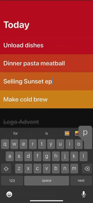
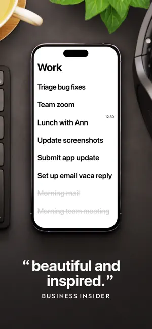
Clear is a colorful canvas for your thoughts, plans and goals.
It's fast, fun, incredibly personalizable, and extra-rewarding to get things done with. Enjoy!
GESTURE TIPS:
? Swipe right to check off
? Swipe more to set reminder
? Tap bottom back button to navigate & explore
TOTALLY FREE TO USE:
??No ads, no subscription, no investors, no paid feature creep.
? Treat yourself in the 100% optional cosmetics shop when you got a lot done with Clear!
■ マーケットレビュー
- Near perfection The current build is incredibly sweet. I was lucky enough to beta test the app for a long time and have been using it for years. Absolutely love it, the interface, and function. Can’t recommend it enough.
One thing that’s missing is to swipe a list to complete all the items on it. Then swipe again to reset it. This was in a previous build but is gone now. Why is that useful? Well if you have a daily list, you’ll want to reset it each day. Or if you have a regular shopping list, a task list you regularly use, or something similar, it’s a killer feature.
(The giant back arrow at the bottom of the screen is also a bit obtrusive. A setting to hide it would be nice.)
- Please restore previous functionality It's good that the app has been updated and looks nicer, but I'm very frustrated that I can no longer move between lists as I could on the previous iPad version.
It also seems that the iCloud syncing between devices is not working properly.
I strongly request that these issues be addressed and improved as soon as possible.
- Worst update ever An app that had long established itself by not changing its beautifully simple UI/UX has made changes to the intuitive controls that should be its strongest point, and the beautiful interface has been revamped by ugly, large text.
And worst of all, you have to swipe deep right to set reminders. The right swipe was assigned to the operation to clear a task, so you had to perform a completely different action in the same direction, and the operation error occurred frequently, which was very frustrating as it cleared the task you had just created. The date display in the reminder is also only very small and placed in the top right corner against the ugly and enlarged task text. It is barely visible.
I even suspect that totally different design team from original has been made this ugly major update.
Unfortunately, if it doesn't improve, I will use Apple's Tasks app.
[ 一覧に戻る ] ※タイトルロゴをタップしても戻れます。