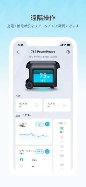
Grossly Disapointing - A Lame dog I just bought a Solex C1000, and it is a great little thing. I thought it was a real winner until I tried the app. It is quite horribly designed. It is glitchy and very hit and miss if it will change pages. Yes, it shows the information you need to know about your Solex, but it is so difficult to read. There is a massive space in which to present that information, but the designers chose to use the smallest text possible. Why? Can you change it in your phone settings? Yes, I tried, but it is still tiny. Also, it beggars belief that the app does not have dark mode to help some people see that minute text, and also to preserve power on the phone. Isn’t power preservation the object of this exercise? Come on Anker, you can do better than this!


 4.4 (評価数 : 313)
 アプリの名称で Google検索
 App Storeでダウンロード